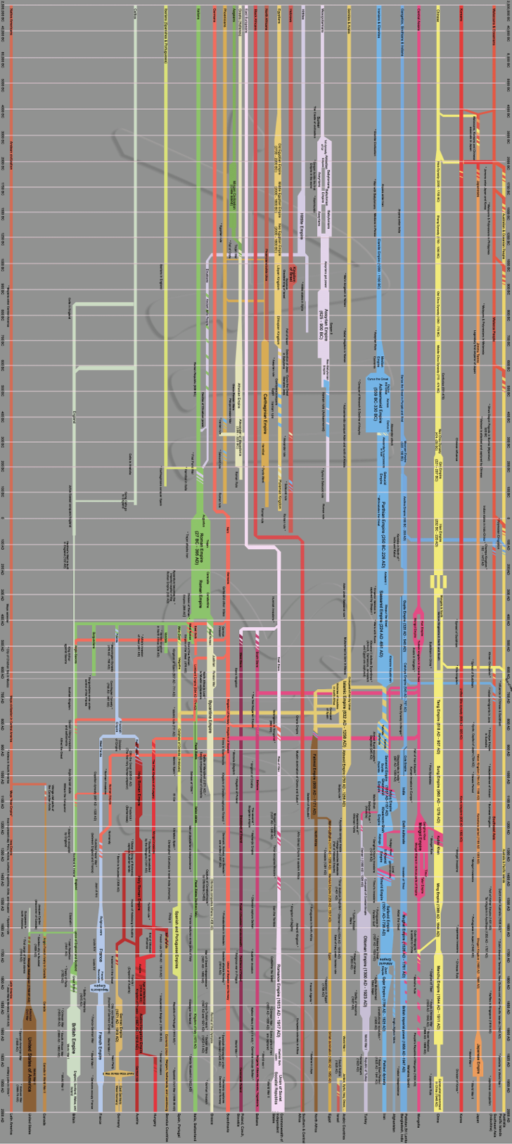
Chart of World Kingdoms by AllEmpires
This chart was designed by Cyrus Shahmiri and is available on the All Empires online history community website. I’ve turned it on its side here for a better preview but if you want to see the larger, original version, you can go directly to All Empires. Because of the similarities, I’m pretty sure it was based on the Hammond Graphic History of Mankind, which in turn was based on this old timeline.